
Chartjunk, 2023. Published in X-Tra, full text below, link to original publication.
Chartjunk
Last July, my mom sent me a link to a New York Times article containing an account by a White House lawyer named Eric Herschmann of a meeting between President Trump and General Michael Flynn. A detail struck me: “At one point, General Flynn took out a diagram that supposedly showed IP addresses all over the world and who was communicating with whom via the machines. And some comment about, like, Nest thermostats being hooked up to the internet.”
Today, basically everyone is a diagram artist. Conspiracy charts, graphics, and maps are everywhere, reproduced in White House briefings, TV news channels, and online forums. The conspiracy diagram is a pop-culture staple, a shorthand for the paranoid fringe–the amateur sleuth connecting the dots with red string in a windowless room. It makes sense that the conspiracy diagram has become so popular: these are marginal times. It feels like we’re all living in the shadow of something big. (Climate change? Social revolt? Economic collapse?) Networks of power and influence operate on a global scale, too big to see from a single vantage point—what Frederic Jameson calls “the absent, unrepresentable totality.” We encounter the signs of these global networks every day, in declining life expectancy, extreme weather, police violence, or inflation, to name a few. Our view of these systems is only ever partial, metonymic, a lack of health insurance or a dead-end job, lived experiences that point to some larger social reality, like clues waiting to be strung together. In these conditions of vague-but-impending doom, the diagram, with its structural, informational aesthetic, promises to bridge the gap between the smallness of our individual lives and the vastness of our collective problems.
There are many types of diagrams, but the kind I’m interested in fall into the “concept map” or “mind map” category. The phrase “mind map” was popularized by Tony Buzan in his 1974 BBC program Use Your Head, in which Buzan taught viewers to use a system of interconnected lines and circles to plot out ideas, a way of organizing information that Buzan described in one of his many books as “nonlinear organic flow.” Buzan compared mind maps to the shape of firing neurons; they also prefigured the decentralized structure of networked computing.
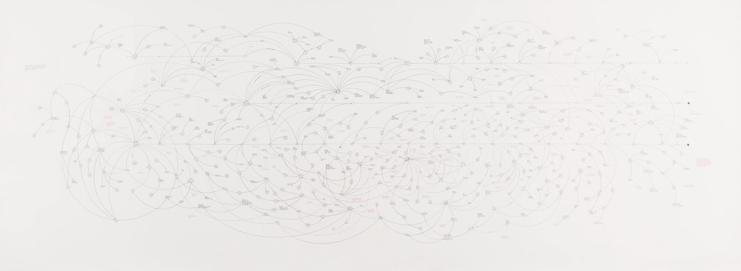
A lot of the current popularity of the conspiracy chart can be traced to Mark Lombardi, a post-conceptual artist who made beautiful and complex diagrams of historical events and webs of power from the mid 1990s until his death by suicide in 2000. According to myth, in October 2001, a month after 9/11 and more than a year after Lombardi’s death, FBI agents contacted the Whitney Museum asking for a reproduction of his final masterpiece, BCCI-ICIC & FAB, 1972-91 (4th Version) (1996–2000), which, among other things, connects Al Qaeda’s financial network through the infamous Luxembourg bank BCCI to Osama Bin Laden’s brother-in-law, Khalid bin Mahfouz, and CIA director Richard Helms.
Lombardi’s work reduces individuals and institutions to interchangeable knots in a net; his drawings favor the connections over the actors. Circles represent people and companies, arrows represent flows of influence, and the color red stands for arrests and indictments. Lombardi’s drawings were made with a French curve, resulting in elegant, spherical forms that suggest his art-school training, in distinction to the amateur, chaotic aesthetic of red-line conspiracy charts. His circular compositions are also more self-enclosed than Buzan’s mind-maps, suggesting the private worlds of the elite: power-brokers, country clubs and backroom deals. These diagrams, while beautiful, are also fairly incomprehensible; they reduce complicated information to a graphic shorthand such that you effectively need to unpack each of Lombardi’s drawings with the aid of multiple Wikipedia pages, which not many people are going to do while standing in a gallery.
In 2014, Gawker published an article called “Chart Brut” that chronicled the emergence of “a new style of folk-art booming on the Internet,” crude diagrams drawn with MS Paint that emerged from anonymous online communities of amateur investigators. Gawker attributed the chart brut style to the subreddit r/FindBostonBombers, a message board established after the Boston Marathon bombing before police had identified the perpetrators. Commenters combed through cell phone images and surveillance footage in an effort to crowdsource the investigation, circulating crude, diagrammatic drawings full of ambiguous and brightly colored ovals and arrows. Not only did they fail to find the perpetrators, the Reddit sleuths mistakenly identified Sunil Tripathi, a missing person whose body was later found in a river. Tripathi was quickly cleared as a suspect, but his family, already dealing with the trauma of losing their son, faced intense threats and online harassment. Despite its poor investigative track record, the chart brut aesthetic lives on, and amateur investigations continue to flourish on Reddit and other online platforms.
The diagrams keep coming. On Twitter, you can see General Flynn posing with Mike Lindell, the MyPillow CEO, in front of a particularly impressive whiteboard covered in squiggly arrows and cutouts of Donald Trump’s head. You can also order a sophisticated array of posters, yoga pants, and coffee mugs designed by Dylan Louis Monroe, the preeminent diagram artist of the QAnon movement. In a 2020 interview with the End of the World Review substack, Monroe explained how he went to art school and wanted to work in fashion. In 2008, following the housing crash and recession, he was laid off from his retail job and, after a year of unemployment, got a job as a “full-time freelance” designer at Marc Jacobs. Monroe describes Marc Jacobs as his “dream job,” but, once there, the situation deteriorated: “My immediate supervisor made my life hell… I worked on the ninth floor and there were cell phone towers on the opposing building looking right at us. That whole year I was having really bad eczema and was stressed out.” Monroe became convinced that the cause of his stress and eczema were x-rays emitted from the cell phone towers, and he moved to Ohio to devote himself to mapping full time. I disagree with Monroe’s politics, but it doesn’t seem crazy to me that, subject to workplace surveillance and faced with a demoralizing lack of agency, a person might look out the window and come to see something like a cell phone tower as a proxy for a global financial system that we cannot touch or comprehend, but that is definitely giving us eczema.
Monroe’s diagrams look fantastic; they represent the maximalist extension of diagram art, compositions that are totally stuffed with information. Monroe himself admits that his design strategy tends to prioritize looks over legibility. “There are times when the aesthetic takes priority over the information,” he said in the interview. “When there’s a gap somewhere I might not have anything to put there, but I’ll add something in just to fill the gap to almost create a pattern.”
The rules for diagrams and other data analytics were codified in 1983 in Edward Tufte’s book The Visual Display of Quantitative Information. Tufte emphasized elegance and clarity; every choice should be in the service of the information. Decorative flourishes are “chartjunk” and must be eliminated. Visual noise and aesthetic clutter represent “an undisciplined ambiguity, with an elusive, eye-straining quality that contaminates the entire graphic.”
Judged against the expectation that graphics should explain something coherent about their subject matter, all these charts—Lombardi, chart brut, Monroe—are failures. They won’t teach you much about the connections between the CIA and the Bin Laden family, or the Boston Marathon bombing, or 5G. Instead of illustrating the systems of power and influence they’re ostensibly about, contemporary conspiracy diagrams describe something else: the anxiety of their makers. To me, the most interesting part of Monroe’s work is the thing that Tufte dislikes: their “undisciplined ambiguity.” As an anxious person myself, I’m drawn to the feeling these charts evoke—their world of graphics, flow charts, text, idea bubbles, logos, and rays that overwhelm both their subject matter and their viewer. Contemporary diagram artists seem to have given up the traditional task of bridging the individual and the system. Instead, they produce maps of the individual consumed by the system, swallowed up, lost in a sea of information—diagrams that are as ambiguous and undisciplined as reality itself.