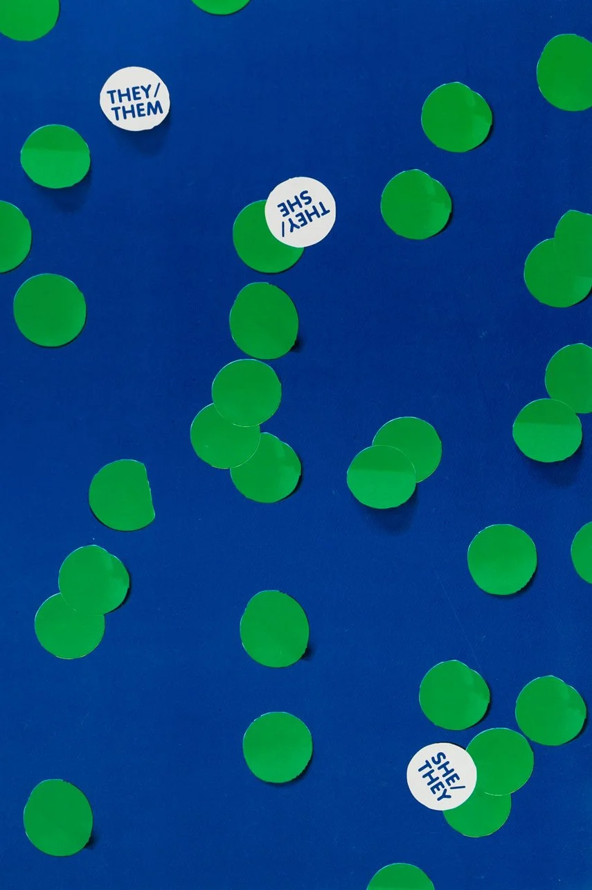

Rite Aid, 2022. Catalog essay for Pau S. Pescador: They/Them, They/She, She/They, Campbell Hall, Los Angeles. Full text below.
Rite Aid
I want to argue that, more than anything, Pau’s work is about Rite Aid. Not always Rite Aid, sometimes the dollar store or Amazon or Target, but I think Rite Aid is the truest wellspring of creativity and inspiration. Mother Rite Aid. I like to imagine that, when our civilization ends in the near future, some lonely survivor will find a fragment of Pau’s art, and they will understand something about what Rite Aid was and what it meant to us.
In 1929, when Harry and Robert Borun opened the first Rite Aid in downtown Los Angeles, it was called Thrifty Cut Rate. (1) This was during the Great Depression, and mom-and-pop drugstores were closing everywhere. The Borun brothers, seeing an opportunity, walked around the city negotiating free rent for a percentage of the gross profits. They opened a series of cut-rate drugstores in the empty shops, ushering in the era of the modern chain pharmacy. According to Raymond Borun, Harry’s son, “They paid no rent, they paid very low wages because there was no other work, and they had wholesale connections to get cheap items, like combs and toothbrushes, very low quality stuff that they sold at very, very low prices.” (2) Free rent and low wages are the building blocks of empire; in 1996, the Rite Aid Corporation acquired Thrifty for $2.3 billion.(3)
Pau’s videos and photos are populated by that “very low quality stuff,” the generic holiday decorations they sell in the seasonal aisle, or the bright plastic toys, or, more recently, those colorful sticker-dots from the office section. Sometimes these materials don’t even leave the store. We see a little tableau, shot on her cell phone, of a wind-up toy gyrating on the shelf or Pau’s hand pointing at a stock photo on a laminated sign near the cash registers. The bright colors in Pau’s work suggest commerce, vivid plastic hues that are unavailable in nature. Cheap thrills.
Pau and I have shared a studio, on and off, since we met in graduate school. At our current studio, there’s a Rite Aid across the street. Pau told me that one day, a couple years ago, the thought occurred to her that she wanted to wear lipstick, so she walked over to the Rite Aid and bought some. Alone in her studio, she put it on. It was a deep, true red. Eventually, she started walking out of the studio wearing the lipstick, and then she started wearing more androgynous clothing, and eventually, over lunch, she told me that she thought that this “wasn’t just a fashion thing.” And now her name and pronouns are different, and her body is totally different, and I can hardly believe that it was ever another way. In my mind, I see her, under the fluorescent lights of the drugstore, stepping out of toys and holiday decorations and into the makeup aisle. The colorful objects that populated her art wrapped around and transformed her body.
Pau doesn’t directly address Rite Aid in her work. What she does discuss is color—the orange lipstick and the lavender accordion skirt (which I coveted). “Color wraps around my body and devours me,” she tells us. It’s cliché to point out the subjective nature of color. I imagine a stoner sitting around, wondering if the way you see red and the way I see red are the same. What if your red is my blue? How can we ever know for sure? Josef Albers made an entire career out of the relational nature of color, explaining that the way we see a color is contingent on the other colors that surround it. (4) In his 1963 classic, Interaction of Color, Albers tells us that “color is the most relative medium in art,” and “[i]n order to use color effectively it is necessary to recognize that color deceives continually.” (5) A blue can become vividly green or purple depending on its placement. There are a lot of optical illusion images on the internet that will demonstrate this effect for you.
Pau and color make sense together because Pau’s art is so wrapped up in the subjective. Her work resists authority and certainty, incorporating misspellings, mispronunciations, cardboard cutouts, and stick figure–level line drawings made on office paper. Color is important, because, like Pau, it is ambiguous and emotional. Color has no form, it’s more akin to a mood or an atmosphere, and, when you try to contain it, it has a way of escaping. Color bleeds.
All this makes color seem otherworldly and transcendent, like a force that we can’t understand or control. But, to bring things back to Rite Aid, color is also inextricable from commerce in the lowest possible way. Color bleeds, and it also sells. Like value itself, color is a social fiction (why does one color come into style and another go out?). Like capital, it is circulatory, able to append itself to one thing and then another, generating wealth and carving the social body into different marketing demographics. Color classifies us, the consumer, by wealth, age, race, sexual orientation, and gender. (6) “Color’s not fully new, it flickered in me for years,” Pau says. Color is a bright object that we can’t resist.
The office supplies and Halloween masks in Pau’s art have a way of bringing all these connotations together at once: the transcendent, transformative, devouring color that is also the cheap crap of late capitalism. And through these colorful objects, Pau tells us a story that we want to hear. This is a person who, in her mid 30s, faced her own unhappiness and saved herself at great cost and effort. And the courage it takes to change your life is very real. But the struggle for freedom is bracketed by the mundane realities and little violences of the workplace, a workplace that, in Pau’s instance, can’t even offer her basic protections without demanding her body conform to an HR checklist. And the paradox of all this is that this job is the very thing she needs to pay for the clothes, lipstick, material for art making, the outlet, the possibility of salvation. As Pau puts it, “Life doesn’t pay for itself.”
Artists are discouraged from talking about their day jobs. We’re supposed to pretend that we’re these bohemians, happy to live on the edge, to sacrifice everything for our art. To want nice things, to love shopping, to want to be happy and comfortable, is the part we’re not supposed to say out loud. Similarly, the flip side of the usual transition narrative—the brave person who finds herself—is that this act of self-discovery takes place against a backdrop of online shopping and the drugstore makeup aisle. Because, in capitalism, everything does: There is no space outside of Rite Aid. But to admit that our personal expression is facilitated by commerce seems like it would somehow detract from the “purity” or “bravery” of the expression itself.
Sometimes when I think too hard about what it means to be a “political” artist, I get depressed. What’s the point of all this representation, when faced with a world that, in my lifetime, has only ever gotten worse? But I watch Pau’s videos and listen to her voice, and I recognize something in my own experience there. I believe that art can give us things that the traditional sphere of political action cannot. Politics demands action and change; activism tends to divide the world into good and bad objects in order to pursue a political goal. Images are ambiguous. Images can be two opposite things at once, without the demand for resolution. A bright color can simultaneously connote both Rite Aid and the promise of freedom, play, or self-determination, without hierarchy or judgment. Art can help explain the contradictions that structure our lives and govern our choices.
We’re surrounded by a sea of cheap plastic toys, the legacy of a world dominated by opportunistic men who filled the city with identical box-shaped stores and minimum-wage jobs. We have to see and understand the cheapness of the world if we’re going to act within it, we can’t look away. Because, if we yearn for freedom, we might as well find some scrap of it in Rite Aid. Where else is there to look? If we’re lucky, the act of playing with cheap toys and bright makeup, the immediacy of these objects, might ripple out and transform our lives in unexpected ways. “And it begins with color, splashed across the body.”
Notes:
1. Alejandra Reyes-Velarde and Samantha Masunaga, “Thrifty Ice Cream—a Portal to Childhood—Is Being Sold to Albertsons. What Does That Mean for Its Future?” Los Angeles Times, May 18, 2018.
2. Chris Nichols, “How Thrifty Ice Cream Became a SoCal Institution,” Los Angeles Magazine, November 4, 2020.
3. George White, “Rite Aid to Buy Thrifty Chain for $2.3 billion,” Los Angeles Times, October 15, 1996.
4. “If one says ‘Red’ (the name of a color) and there are 50 people listening, it can be expected that there will be 50 different reds in their minds.” Josef Albers, The Interaction of Color (New York: Yale University Press, 1963), 3.
5. Ibid.
6. “No signifier is truly arbitrary, and though the meanings of colors are not permanently fixed, they contain, and are in fact formed through the layering of contested, ideological histories of content. Social, economic and political pressure coalesce into form, and at some point, petrify into a generally accepted vocabulary.” Kevin Yuen Kit Lo, “The Propaganda of Pantone: Color and Cultural Sublimation,” Loki Design, 2016.